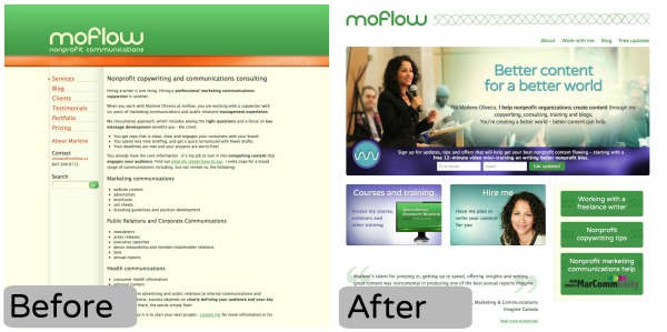
Have you noticed that moflow.ca looks totally different now? After months of planning, rebranding, rethinking, redesigning and rebuilding I’m so thrilled with my new and very much improved website.
I’ve been working with Mike Mella of Be Like Water, to tackle many, many changes and improvements. Here are the highlights:
New look
Earlier this year, I worked with Katherine Moffat to develop a new visual identity for moflow. The design of my new site incorporates this new identity, including an additional font, new colours and new graphic elements.
New content management system/platform
For the new site, I’ve switched from Expression Engine to WordPress. I find that WordPress plays nicely with a number of online tools, sites and applications I like to use. But more importantly, the switch also allows me to work with one platform across NonprofitMarCommunity.com, WriteBetterNonprofitWebsites.com and moflow.ca
New content and structure
With the exception of archived blog posts that we have moved over, I’ve rewritten all of the copy. Everything. The new content, combined with the completely new structure for the site does a better job of showcasing the breadth of what I offer to support nonprofit communicators – with a more personal touch.
New priority call-to-action
A priority for me this year is to do a better job of staying in touch with those interested in my content, training and services via email. So you’ll notice (it would be hard to miss) that we’ve made signing up for email updates as easy and obvious as possible.
I’m really pleased with and proud of my new website. I hope you like it too – and more importantly, I hope you find the content and resources useful!